Taxing unhealthy food helps cut obesity, says global study
Research prizes galore and sex differences in inflammation: News from Imperial
Imperial academic wins €2.4m European funding to improve solar harvesting tech
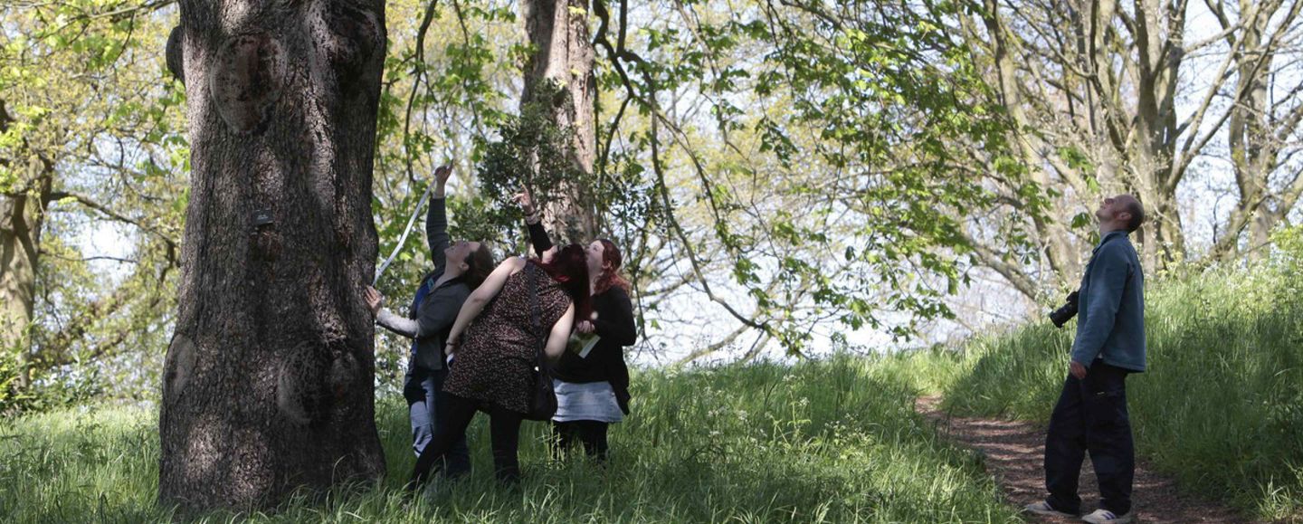
UK-wide citizen science initiative that ran from 2007-2019 and enabled the public to get hands-on with nature